As noted previously, I’m thinking about starting an iPhone App, so I’ve been paying closer to attention to things I like and dislike about some of the apps and games I’m using.
I like playing the occasional game on the iPhone, and in the last few weeks I was playing a lot of Siedler of Catan (Settlers of Catan in English). Just to be sure: The adaption of the board game is done quite well, the computer players have different strengths, so the game provides fun and entertainment for a long time. Well spent 4€ (or 5$)!
However, there are a few issues that I have. The start of the game features an elaborate animation .. but there is no way I have found to get straight into the game. So every time you start the app, after waiting a few seconds for the animation to load, you get the start of the animation


That’s three useless taps (and probably 10 seconds of time) that I would consider bad style for an iPhone app. (It’s okay for a PC game, but not for an iPhone app that gets frequently stopped and restarted.)
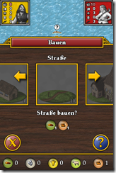
There are a few other examples where a bit more thinking would have helped create a better experience. For example in this screen you have only three options, but the graphics don't fit the screen so there may be some scrolling involved:

I’m sure that these issues arise from trying to be consistent with other versions of the same game, but I would think that some more care should have been taken while adapting the game to the iPhone.
So five stars for the basic game, but only one star for the iPhone adaption.
