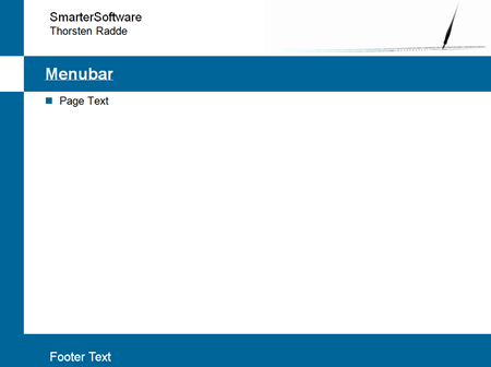
Just finished a major re-design of my business website. Most of the work seemed to be to just figure out a basic design (also something that I’m not really good at). In my previous post I included a mockup of the design I had in mind. I managed to get things almost exactly done as I wanted.
There were a few things I changed in the html:
Menu Border Images
In the old design, there were little images at the left side of the menu bar:
This added a nice border to the menu bar, but of course this was totally a visual thing and nothing that belonged in the html. It should have been a background image of the div that made up the menu bar. In the new design, the images were no longer needed, so they were removed from the html files.
SmarterSoftware Pen Image
In the header of each page, I have an image of the company logo, a pen writing some digital code (originally designed by Leo Blanchette at Jesterarts):
As this is also nothing structural, I’ve moved the reference to the image from the html to the css file as a background image. This is not totally clear-cut as with the menu images. In the first version I made the image a link to the initial splash screen with a large version of the pen. I’m not aware of any way this can be done with a background image (other than with JavaScript, which I may do in another version).
Additional divs
The only thing that was a bit tricky to do in CSS was the way I wanted to “switch” colors in the left “column”:
I’ve played around with the “border-left” properties but could quite get it to work.
Here’s a little code snippet of what I finally implemented:
HTML:
<div id="header" class="outer"> <div class="inner">
<p> Smarter Software </p>
</div> </div>
<div id="nav" class="outer"> <div class="inner"> <ul>
<li><a id="current" href="home.html"> Home </a> </li>
<li>• </li>
<li> <a href="loesungen.html"> Lösungen </a> </li>
</ul> </div> </div>
<div id="main" class="outer"> <div class="inner">
<h1>Wir über uns</h1>
</div> </div>
CSS:
.outer {
    background-color: rgb(0, 102, 153);
    margin-right: 20%;
}

.inner{
    background-color: white;
    margin-left: 15%;
    padding: 10px;
}

div#nav.outer, div#footer.outer{
    background-color: white;
}

div#nav .inner, div#footer .inner{
    background-color: rgb(0, 102, 153);
    padding: 0;
}
The outer divs define the color in the left “column”, usually blue (the rgb-color). Also, with the right margin set here, the color to the right of the text will be the standard background color (usually white). We could move the margin-selector to the inner class, so that the color on the left would be repeated on the right. The outer div only contains an inner div, but no content on its own.
The inner divs then define the left margin and the background color for the “main” content area. Usually, it’s a white background, but for #nav (the navigation or menu bar) and the footer the colors are swapped between the inner and outer divs.
This achieves the desired look, but introduces extra divs that are purely presentational. Does anyone have a better idea how to achieve this look without additional divs? Any ideas are appreciated!
Summary
I was quite happy that there weren’t to many changes required. Once I got the main page done, there weren’t many steps required to get the whole website changed. Total re-design took two evenings on X-mas, maybe 4 to 5 hours of work in total (including this blog-post). Not too bad!


